Details
-
Bug
-
Resolution: Done
-
High
-
None
Description
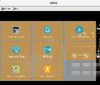
When the ability to have translucent UIs was new, having menus etc as translucent was very fasionable but now a days it's not considered cool. From UX POV, it lowers the visibility of the foreground UI and if there is text, it's hard to read. Attaching a screenshot of HMI sidebar to demonstrate this (the "Climate Control" label is not so easy to read with text behind it).
Attachments
Issue Links
- blocks
-
GDP-172 Finalize integration of 'new HMI'
-
- In Progress
-
